Saturday, 29 May 2010

Hot and Spicy Tilda


Challenge card for:
Sketch Saturday – design sketch

Just Magnolia – Hot and Spicy

Passion for Promarkers – anything goes.

Happy Tilda has today been given a feather boa to play with! – Well, a tissue paper one in actuality. Poor girl, I do make her do some things..... It was white tissue paper coloured with my Promarkers to match the hot and zingy colour theme. Tilda has been coloured with Promarkers too of course.

I used bright orange cardstock and papers from DCWV and HOTP, not to mention the glittering gold mirri to add a bit of pizzazz to form the basis of the card. The punched detailing running horizontally was done using a Fiskar’s punch. To add more glamour I used the jewel bling, and voila- we have today’s card completed.

Short and sweet today. Enjoy your day, even if it is raining (good excuse to stop in and craft!) LOL.

Bye for now.

Tine :)

Friday, 28 May 2010

Late


Hi everyone, and today’s card is for the following Challenges:
I Love Promarkers – design sketch

Abc challenge – V is for vintage

Passion for Promarkers – anything goes.

Whilst using the design sketch as a base, the lynchpin to this particular card has to be the vintage theme as it has dictated how I used the card, paper and the image as I hoped to convey age in every design element.

To that effect, I turned the rectangle of the sketch to the ‘fancy bracketed shape’ (well, that is how I think if it!) and added the easel. I am sure this shape must have a name...if it does, feel free to enlighten me please, as ‘fancy bracketed shape’ is a bit long-winded!!!!! I chose this shape though as it seems to be an ‘olde’ style reminiscent of what you might find in Victorian times whilst still retaining the length of the original rectangle of the sketch. The backing papers are from HOTP and the main one has been inked at the edge with black whilst the horizontal leather-look one has a ‘Tea Dye’ edge to the fancy cut edge. I was after a tooled leather effect for that particular one. LOL. (....I can but try!!!)

The image is one from Mo’s Digital Pencil of course and I have coloured it with Promarkers, going along the outside edge with Tea Dye distress ink from Tim Holtz before adding to the aged effect by dotting a couple of age spots here and there. The image’s mats have also been distressed.

Having swapped sides on the design sketch, placing the image to the left, the two elements I chose to go onto the right hand side were the pocket watch and the pocket. The watch was an old foam backed stamp which needed hands drawing on with my fine liner before being tea dyed and a gloss effect added to the face for the glass front. I gold gel pen just touches the edges and it has been set on the card with silicone glue - the chain as you can see, is nothing fancier than a peel off. The pocket was made from two layers of paper so that the top element looked folded over, with a Promarker run around the edges to give it a 3-d effect before being sewn onto the card. The sentiments were made on the PC and again distressed.

Well, as ever, I really appreciate the comments you leave me.
Thanks,

Tine :)

Wednesday, 26 May 2010

Fairy Flora


Hi everyone and today’s card fits the criteria set by the following Challenges:
Friday Sketchers – the design sketch shown above

Flutterby Wednesday – butterfly, fairy or angel

Passion for Promarkers – anything goes.

I know the sketch shows an oval in the centre of the card, but I have used ‘artistic licence’ and expanded it to a circle which is more in keeping with the image I have chosen. The totally gorgeous drawing of a fairy is of course from Mo’s Digital Pencil and is entitled Fairy Flora. She has been coloured in with Promarkers and I have hopefully imparted some iridescent qualities to her wings by the use of glitter glue as well as lilac Stickles. Not sure you can see this too well in the photo though. I keep fiddling with different settings on my camera trying to get the best ones to capture my cards but they never come out looking like they do in ‘real life’. Any tips anyone has would be gratefully received. Anyway, back to the card.......Flora is encircled with a pink and white card ring which is carefully wrapped with a narrow silky ribbon. This has then been matted up following the design spec, and a couple of the mats have lilac Promarker edges.

I seem to have been making a fair number of my own flowers of late, and this card has yet another version. This time I cut out petal shapes from white tissue paper and edged with my Promarkers to make sure everything matched exactly and also added a few veins for good measure. I wanted a ‘light’ flower which echoed the background paper (well, the fairy is called Flora after all so and extra flower wouldn’t go amiss!!!!) As for those papers, they are all from Cuddly Buddly - and a few gems from my stash added at the relevant corners.

I would really appreciate it if you could leave a comment in the box for me, especially if it is a nice one ;) before you move on as I appreciate you all visiting.

Thanks for passing by,


Tine :)

Monday, 24 May 2010

Soft Green and Aqua


Challenges:
Just Magnolia – design sketch

Colour Create – colours of soft green and light aqua

Now I am pretty certain that the papers I have used on this occasion are K & Company, but it has to be said, I can’t be sure. I bought a scrapbook with matching papers a while ago so I don’t have the original packaging to refer back to and so only have my memory to go from as regards the manufacturer. These papers might have been in the right colours for the challenge but they were actually all oriental in style so I have used the less obviously oriental ones for this particular card to keep it more in keeping for Tilda.

Tilda herself has been coloured with Promarkers and she is raised up from the white card oval (created using a shape from a Glitter Girls’ board), with silicone glue. The white lacy border at the bottom was created using a Martha Stewart punch, the deep trellis and I used a white Gelly Roll pen to create the fake stitching. As for the handmade flowers, I wanted to create a stylised design and these two have centres of rolled up paper coloured with Promarkers to match Tilda’s dress exactly.

Well that is all for today as I have a mountain of ironing!
Bye for now,
Tine :)


Saturday, 22 May 2010

Love doesn’t see colour.


Card for the following challenges:
Sketch & Stash – design sketch

I Love Promakers – make your own flower

Mo’s Digital Challenge – love.

This was not going to be a PINK card....but as you can see...it ended up a PINK card. I had so many possibilities roaming round my head - and pink wasn’t amongst them. However, one by one, the other colourways lost the battle leaving pink room to take over. It was the same upheaval for the battle of the flowers. What sort should I make? I eventually decided that the most compatible with the L-O-V-E theme had to be that of a rose. A rose, the ancient symbol of not only love but of beauty too, associated with Greek goddesses as well as the Virgin Mary. And this drawing from Mo is a little beauty isn’t she? Come to think of it, 'rose' means pink or red in a number of languages...... There you go, no wonder the combination of a pink page and a rose won. It was preordained!

As for the sort of rose, I decided upon a big, blousy rose, the sort that you grow in the garden (might even look a bit tattered around the edges), but gives all it has got to give before throwing it’s petals to the ground. However, the beauty of a paper rose is that this one won’t be throwing its’ petals, well, not if the glue is strong enough! LOL. I used Promarkers around the edges and delineating a few veins on the petals and then added sparkling Stickles for good measure. The leaf behind it was simply cut from the white paper with pinking scissors and it was embossed by running my embossing tool along where I wanted the veins to be.

The papers were relatively new to my stash and had so far been unused having not quite made it to a scrapbook page layout. They are from Papermania called ‘Raspberry Champagne’ and seemed to have the right combo of floral with hearts to cover both criteria of the ‘love’ theme and ‘floral’. I teamed them with chocolate brown card ground which also runs behind the horizontal mat. I have also used my sewing machine to attach the background paper to the card.

The image of course is Mo’s and one I have used before maybe, but I like it - and she’s cute! But I wanted it to say a bit more than she loves her doll. I made the doll black to show love between people of all colours and races. I hope I have also made the doll look like plastic rather than skin & flesh, so I coloured the child and the doll differently. I have of course, used my Promarkers.


Well, I have seemed to have gone on a bit today. Hope you weren’t bored with my prattling on....that reminds me, I have an email to write. LOL .....Thanks for coming to my blog, and if you like my card, please don’t be shy and leave a message so I know you have visited. :)

Sunday, 16 May 2010

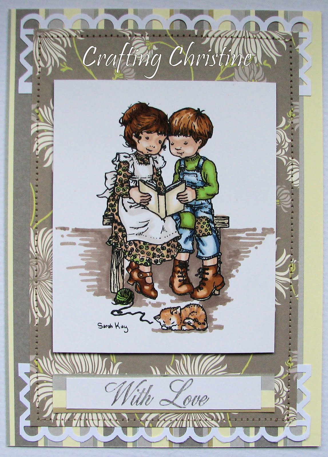
Reading Together


Hi, and today’s is specifically for Challenges found at:
I Love Promarkers – design sketch

ABC Challenge – unused stash.

I have used a Sarah Kay Stamp (Quiet Moments), and two papers from a previously unused Laura Ashley Stack I had in my cupboard. You can surely not go too far wrong with this yester-year image coupled with florals from the renowned designer famed for old-style prints – well, I hope not anyway, as I decided to use this combination!

The image has been coloured with Promarkers to match in and co-ordinate with the background papers - a free flowing floral hopefully reminiscent of a less complicated bygone era and a striped one, chosen to match in and emphasis the rectangular design sketch. I have teamed these with a punch from Martha Stewart to act as lace peeping out from the top and bottom but extended it out beyond the edge of the floral paper which is to represent the ‘added extra’ features on the sketch, though in this case they are not small squares set at opposite corners, but the half-diamonds from this trellis punch & at all the corners. I have then secured all these layers together with matching thread on the sewing machine to hark back again to that ‘olde-worlde’ idea. The stamped image has then been attached with foam tape to add a bit of dimension.

The sentiment at the bottom has been stamped with an Anita’s wooden backed stamp onto white card and then mounted onto striped paper.

So, that is how I constructed today’s card. Hope you all like it enough to leave a comment as you pass through. Thanks, and don’t forget to visit my blog again sometime. :)
P.S. – If my daughter is reading this, I assure you any similarities between you and your brother a few years ago are totally co-incidental, even though his hair cut used to be remarkably similar to that of the little boy in the image!!!!!! LOL.

Saturday, 15 May 2010

Taking Stock of Her Dreams.......


Good day to you all and I hope all is going well for you. I have created today’s card specifically for 3 Challenges. Those at:
Friday Sketchers – sketch as illustrated

Mo’s Digital Challenge – flowers

Quixotic Challenge – make your own flowers .

As you can see, the main feature of today’s card is Mo’s beautiful drawing which I have decided to colour with my Promarkers to match the chosen papers from Cuddly Buddly & used with matching plain card. I wanted to convey and emphasis the wistfulness of the young girl daydreaming, so chose a simplistic floral paper which reminded me of Stocks (which I loved as a girl, and still do), and the butterfly motif paper which I hoped would echo her flitting thoughts ....oh to be so young and carefree!

I only needed to create flowers as ‘easy going’ as those on the paper and on her pillow so drew a couple freehand onto the matching card and coloured the edges with my Promarkers. I then attached them with silicone glue, so it would support the shaping I had done to the petals. I then finished it off with matching sparkly stones I am sure any girly girl would like.

I think the photo is actually looking a tad bluish compared to the actual card, ah well, it might be gloriously sunny just at the moment but it is currently not shining in my direction! Enjoy the rest of your day, and if you have time, I would love it if you could leave a comment. Thanks. :)

Friday, 14 May 2010

Circle Ted


Hi everyone, and I have made today’s card for the following Challenges:

Truly Scrumptious – design sketch

Sweet Stampin – colour challenge (yellow, green, orange and pink).

Having chosen a floral background from Do Crafts to which I added faux black blanket stitches with my Letraset fine line pen, I made 2 circles from matching card & used a sewing machine to create a running stitch around the largest one. To this circle I then distressed the edge and cut small slits up to the running stitch before ‘ruffling’ it up slightly to add a bit of dimension & interest.

Having stuck the smaller circle to the larger one, I used Promarkers to colour in an image from Cuddly Buddly which also happens to be within a circle itself. It is one of a number of digi stamps drawn by Kim Macfarlane available from their website. I then added glitter glue to the centres of the flowers within this image and Glossy Accents from Ranger around the shapes of the two hearts and the bear’s nose. I then also added the same gloss finish to the edge of my circular sentiment and to the small flower (taken from the background paper), which was then attached to the middle of the sentiment circle to finish it off.

I do hope you all like today’s card and I would love it if you were able to leave a comment for me so that I know you have visited. Have a great day yourselves!