Wednesday 30 June 2010

Orange, Chocolate, Strawberry and Vanilla


Challenges:
I Love Promarkers – stripes

KaboodleDoodles – celebrate summer

CraftyCatz- digital

DigiDoodle – anything goes

Mo's Digital – anything goes.

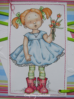
Well, I do have a weakness for Mo’s images. So here is another and a recent addition to her range. The image is called ‘Brady and Chloe’ and the girl’s sweet little outfit seemed to lend itself to the theme of ‘Stripes’ but being a sucker for punishment, I then drew myself more stripes onto Brady’s shirt before colouring everything in - with my Promarkers of course. Whilst I didn’t go overboard and ‘funky them up’ by putting coloured stripes into their hair, I hope I had added to the stripey theme by putting loads of highlights into their locks – well, it’s a bit stripey! LOL.

The colours I chose came from the choice of paper from MyGrafico which were just right (not to mention stripey!) for what I was thinking of. Maybe the colour-scheme felt right because it was hot I wanted and ice-cream, but it kind of suited the pair of them I think. I created the circular sentiment on the computer but it had the stripey treatment too, with the added outline. The lovely striped ribbon was from my stash and it is next to a strip of card to form stripes in the opposite direction. I then added the 2 gems, which in a row, form their own mini stripe! Maybe a dotty card will cure me as I am now seeing stripes everywhere.

That’s all for this card. I would love it if you could find the time to comment.

Tine :)

Monday 28 June 2010

Aqua, pink and blue Tilda


Challenges:

Just Magnolia #61 – sketch/Magnolia stamp

Cute Card Thursday – reuse/renew/recyle

Magicalcrafts - flowers.
As I hadn’t made a ‘Tilda card’ for a couple of weeks I have now remedied the situation. Especially when I saw that gorgeous sketch Bev created over at Just Magnolia’s blog – I just had to join in when I saw that!

This stamp is called ‘Tilda with Flowing Hair’ and I used my ever faithful Promarkers to colour her in to match my chosen papers.

The background papers in question were a digi download from ‘Cardmaking and Papercraft’ a while ago and were just the fresh combination of aqua/pink/blue that I was thinking of. This combination of colours seem to make white ‘pop’ from the page which I hope adds to the ‘fresh’ feeling. The lace effect punch is from Martha Stewart, as is the leaf punch and the butterfly punch. I did however make my own large white flowers for this card using the white tissue paper that came with a new shirt. I also coloured a bit of this tissue paper with my Promakers in matching colours and stuck it behind the butterfly so that it peeked through the cutwork design. The smaller white roses, pink ribbon and gems were from my stash.

Tine :)

Thursday 24 June 2010

Ted 'n' Ed


Challenges:
Sunday Sketch and Stamp – sketch

My Time to Craft – yuletide in June

ABC – X for Xtra dimension

Simon Says Stamp – gotta have friends.

All those of a nervous disposition stop reading here....Xmas card alert! My first of the year but as we all know, it won’t be the last...... Ah well, biting the bullet I will go on......
These two happy-go-lucky bears are a digi from Cuddly Buddly and they have been coloured with Promarkers, until it got to the trim on their fluffy hats that is. I had thought of using Flower Soft, but the Ivory was too cream compared to the papers. As this meant a bit of lateral thinking was called for, after a bit of head-scratching I was a bit adventurous and got some white toilet roll, dampened it and scrunched it into shape, leaving it to dry overnight. I then glued it into position. Not sure whether it worked but it is certainly textural! LOL. I made the 3 snowballs in the same way.

The papers are from HOTP, from the Cardmakers Xmas pad. The image has been set up from its grey and silver mat with foam tape but I don’t think the photo shows this particularly clearly, but there is a bit of a shadow there to give this away.

Hope you like today’s offering to blog-land.

Tine :)

Wednesday 23 June 2010

New Baby


Challenges:
I Love Promarkers – sketch

Sir Stampalot – punch it

Craftalicious – monotone (one colour plus white)

Gingersnap Creations– shades of blue

Rosie D’s – blue.

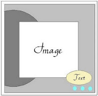
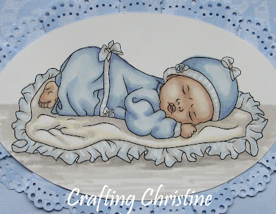
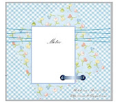
Hi everyone, and over at I Love Promarkers were I am lucky enough to be the GDT this month, we have been sponsored by Digi Doodle Shops. Why not pop over and check out the lovely images they have available. I am sure you will find something there to tempt you. I chose to work with ‘Sleeping Infant’, and isn’t he adorable? The sketch seems to have fitted this digi perfectly.

I matted a couple of layers of background papers, stitching them down onto the white card base. The main patterned one is Inspirations scrapbook paper and the two matching borders running either side of the ribbons down the centre are also from the same range. Behind the oval image is a lace border created by punching more of the main paper with a Martha Stewart border punch and then cutting into strips 2cm deep. I then slit into this border nearly up to the punched out holes and overlapped either sides of the slits to form ‘pleated folds’. This meant that I was then able to manipulate the ‘lace’ to run behind an oval shape. I know I could have used real lace but would I have found a perfect match, and besides, when did I make things easy for myself? LOL. I used the same MS punch to make a white border for the rectangular part of the sketch, dovetailing the corners as it wasn’t a ‘Punch Around the Page’ design. This too was sewn into position but I matted it first onto card to help stabilise it whilst stitching.

The image has of course been coloured with my Promarkers and doesn’t he look cuddly and peaceful? The two ribbons were from my stash –the wider, white one is well travelled as my daughter brought it back from India for me last year! The sentiment was done on the PC.

That’s all for today. Hope you all like today’s card!

Tine :)

Monday 21 June 2010

Jack


Challenges:

Cute Card Thursday – sketch

Crafty Creations – stitching

ABC – weather – (wind, blowing the balloon).

The image is ‘Jack....waiting’ by Mo Manning. Well, all of the image bar the balloon through the window that is. The large, empty sash window is just asking, ‘what could he be looking at?’ There are so many possibilities.....I have got little Jack contemplating the passing flying balloon, wondering where it was going, who sent it and what the attached card might say....not to mention how can I get the balloon? LOL.

Coloured with Promarkers, I was torn for the decision as for the best light source, given that he is at a window. Might he be inside with the light on? Is the daylight stronger? Does this mean there are two light sources to alter the shading? Do I just over-think things?!!!! LOL. Once coloured though, I chose to give him a fairly wide mat so that I could emboss his wallpaper. Nothing like a bit of anaglypta! This was then matted up with red card to match his jumper.

The backing paper was taken from a MCS CD, the ‘Triple Treasures’, and this has been sewn with matching thread to the base card. Following the design sketch, the two horizontal mats are plain white card that has had black fineliner drawn around the edges to echo the drawing of the window in the image. They were then hand embossed with straight lines, again to reflect the elements of the sash window. There are straight lines embossed onto the yellow card too, to tie it all together – well, hopefully it does.

That’s all for today,

Tine :)

Saturday 19 June 2010

Shanna


Challenges:
Everybody Art Challenge – sketch

Mo’s Digital – dry embossing

Crafty Creations – stitching

Stamp Something – something summery

Pollycraft #48– sing song ( ‘Sorry seems to be the hardest word’ – Elton John)

The image is ‘Sorry Shanna’ from Mo’s Digital Pencil and she has been coloured, as is usual for me, with my Promarkers. The requirement over in Mo’s Challenge this week is for dry embossing and I used a fairly new acquisition from QVC (no manufacturer mentioned) to create flowers and leaves on the white mat behind the image. The stripy paper is from K&Co part of a 6” mat pad and the textured green card, ribbon etc., are from my stash.

Bye for now,

Tine :)

Thursday 17 June 2010

Wedding card and box


This card was made for the wedding of the son of a friend of ours but I shall also enter it for a couple of challenges.
Creative Cottage – it takes two (in this case, card plus box)

Papertake – ice cream flavours (vanilla)

My time to craft – Xtra special

I must start with an apology for my camera work. No matter where I try to set my shot I either get dark shadows or the whole image turns a different (greyer) colour entirely. It is so annoying!!! Grrrrrrrr. Still, I am sure none of you want to hear about my pictorial malaise.

I made this card and it’s box, from what was described in the shop as ‘pearlescent’ card, though whilst it has a certain sheen to it, I wouldn’t have called it pearlescent myself. It is pretty though, and perfect for a wedding card. This is where a good photo would have benefited. It is white but not a pure white so looks rather classy and I used it in several layers. From the main square base I made a layer just slightly smaller, punching it with a MS border punch and retaining the straight edges which you might otherwise discard. On top of this is another layer of this card, this time hand embossed (I don’t have a die-cutter/embosser anyway) using one of four floral and swirl background embossing stencils I bought from QVC but I have no idea of the manufacturer.

The image is from Precious Moments -and aren’t the tiny birds weaving a heart from her sash so sweet! I used my Promarkers to colour it in as I usually do. LOL. The MS butterflies were cut from the same white card as I used for the image as contrast to the creamier base card and the flowers were from my stash.

I then had to make a box for it of course, as it was too deep for an envelope and I made it from matching ‘pearlescent’ card stock. I embossed a matching square for the centre panel which I raised up using foam pads and onto this I popped a heart embossed using a Glitter Girls board, the ‘Celebrations’ one, & highlighted it with a silver gel pen before topping it off with another of the roses. The butterflies on the box differ to those on the card as I used Promarkers to colour the card lilac and sprayed it with Crafter’s Companion ‘Spray and Sparkle’ before punching them out and adding their jewelled bodies. Maybe my box needs a box now!!! LOL.

Bye for now,

Tine :)

Wednesday 16 June 2010

For You Daddy

Challenges:
I Love Promarkers –use a bear on your project

Pollycraft – song (‘Daddy’s Little Girl’ by Peter Love)

Incy Wincy – one for the guys

Creative Inspirations - Father's Day or male birthday

Stamp Something - happy

Cute Card Thursday – anything but a square.

The first part of the card I had to construct was the actual card base, first drawing out what I wanted the card to look like and the appropriate size so that I could make my own paper template. As you can see, this was to be a large cupcake, though the spine of the card is still there behind the bear so that it opens out easily and in the regular way.

I used a Martha Stewart punch to create the frilled top of the ‘paper case’ and used the sewing machine to create the idea of the concertina ‘folds’ in it. This paper case is much prettier than one for a real cake though as I used a beautiful pearlescent paper to cut it out of. No self respecting cupcake (or fairy cake, as it should perhaps be called), is seen without a shapely red cherry on the top - well, certainly not one that a little girl would pick anyway, even if she doesn’t eat cherries and spits them out! She would also choose a cake with ‘hundreds and thousands’ or sugar strands placed enticing onto the icing, so this cake too has its share, created with bugle beads.

The cute bear image is ‘Kiki with cakes’ from Pollycraft and she is one of a few digis I was lucky enough to win on the I Love Promarkers blog a few weeks ago. She seems to be quite a long-haired bear by the outline so I have tried to colour her in with my Promarkers to that effect too. I didn’t want to over colour her dress etc though, as after all, this is a card for a little girl to give to her dad, so kept that part of the colouring fairly simple. I also chose colours which a little girl would likely choose for herself – pink obviously, and fresh, soft yellow to echo the large cake’s wrapper.

To complete the card I popped tiny red beads onto the top of one of the bear’s cakes and there is red too in the outline of the sentiment, made on the PC.

Thanks for visiting my blog today.

Tine :)

Monday 14 June 2010

Cuthbert Yo-Ho’s Perilous Adventure.....‘Jolly Roger’ (Adam & the Ants)


A tale of the exploits of a daring young bear.....

Starring: Cuthbert Yo-Ho (Pollycraft)
Special guest: tea stained white paper
Supporting cast: Starred paper from HOTP Xmas Card makers’ pack
4 sheets of varying blue paper with white core
Black card
Silver mirri card
Promarkers and black fineliner
Inkpads- blue, black and tea Distress Ink

Filmed for:
Sketch Saturday- sketch

Pollycraft Challenge – ‘Let’s have a sing song’ - Jolly Roger (Adam & the Ants)

Incy Wincy – one for the guys

Stamp Challenges – happy (Cuthbert looks happy to me, LOL).

OK, so enough of the film references.....LOL... But that said, I do love the song challenges. They are such fun! When I saw the sketch, the image of Cuthbert in his boat came straight into mind. It seemed perfect for him. Others might have seen punched lace borders, I saw rolling waves for a little wooden boat. So, for today’s card I started by tearing the blue papers using a tearing ruler to reveal the white core for the crest of the waves and then doing the same to a strip of black card which then had its ‘wave’ edged coloured with blue ink half way up.

The treasure map was white, torn paper which was stained with a tea bag (old ways are sometimes the best!) as I wanted a more crinkled authentic looking result. When this was dry I edged lightly with the Tim Holtz Distressed ink for definition and then with a touch of black ink. I drew the map and its details with the 0.3mm fineliner pen - X marking the spot under a palm tree of course!

The image was coloured with Promarkers, hopefully giving Cuthbert a bit of a furry feel and the picture was then given a blue ink edging to match the colour given to the black waves. Poor bear is travelling night and day to get to his Treasure Island. LOL.

Think that is all to tell you about this one. Have a good day!

Tine :)

Friday 11 June 2010

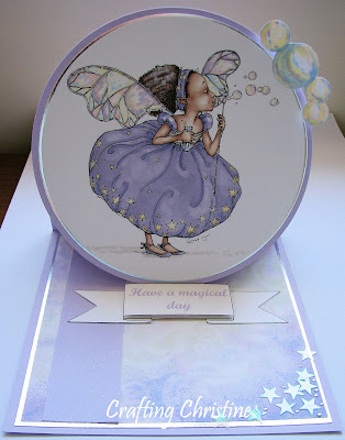
Fairy Tabia’s Magical Day


Challenges:
Papertake Weekly – sketch plus added twist of lilac/lemon

Mo’s digital – easel card

Quixotic – fold it

Cute Card Thursday – anything but square

Stamp something – happy (colouring Tabia made me happy! LOL).

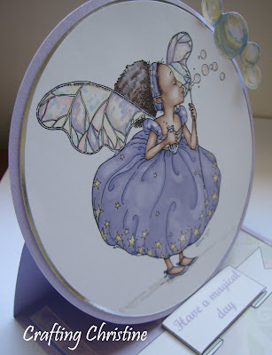
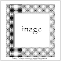
Well, I started off basing everything on the colour scheme suggested by Papertake and their sketch, but by the time it I had finished the card it had altered slightly. (Well, they do say it can be based ‘loosely’ on the sketch. LOL). Mind you, you can see that the basic sketch is still there in the square base, just not an exact replica of the sketch anymore. The thing that altered is the ‘raising up’ of the image – she is kind of still in the same place as the sketch, just raised off it on the easel element and in a circle instead of a square -as I thought it suited her bubbles more. So I hope you ladies don’t mind so many variables!

The image is Fairy Tabia as drawn by the immensely talented Mo, and she has been coloured in using Promarkers. Tabia is blowing extra bubbles too, which I have created to extend outside her circular mat and which are also coloured using Promarkers, but they were also given a Glossy Accents coating for extra shine.

The background paper is from Damask Delights by Artylicious which I think helps give that ethereal quality to the fairy – a ‘there but not there’ sort of feel, but maybe that is just me. The lilac paper strip was given its sparkle from a light spraying with Crafter’s Companion Spray and Sparkle but I am not sure that the photo shows it well enough. The sentiment was made on the PC, decoupaged and set up on foam pads to hold the easel into position. The stars and small rhinestones in the front corner were from my stash.

Hope you all like today’s card.

Tine :)

Wednesday 9 June 2010

Spidermouse! Spidermouse!


Challenges for this card:
I Love Promarkers – design sketch

Stamp Challenges – digi something.

I am sure you all know by now that this particular stamp of ‘Spiderman Henry' is a free digi from Whiff of Joy. Isn’t he fun! Needless to say he has been coloured in with Promarkers.

The ‘rope’ that Henry clutches in his right hand has been extended roughly about 1cm using a 3.0 fineliner pen so that it reached the corner of the white square. This was so that it would reach the ‘skyscrapers’ behind as if he was swinging out from there. As his left hand seems to be tilted as if to throw a web out, I created a web for him by sewing very fine, sparkly thread from his wrist to the edges of the mat, securing it with tape behind.

The image has been mounted onto foam pads but they also run behind the row of houses/apartments running along the bottom of the card which I created on the PC, though the differing shades of sky where done with the Promarkers again. The circular sentiment was also created on the PC.

Hope you all like this card too.

Tine :)

Tuesday 8 June 2010

Wish Fairy Finna


Challenges:
Passion for Promarkers – pink birthday

Sketch Saturday – design sketch

Colour Create – baby pink with pastel blue

Creative Inspirations – at the beach

Stamp Challenges– digi image

Everybody Art Challenge – things with wings.

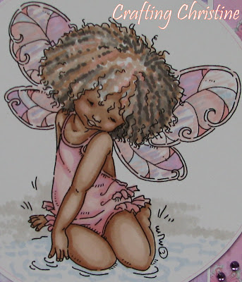
The image is Fairy Finna available from Mo’s Digital Pencil and she is beautiful. Love her to bits. She is so happy sat there thinking her own thoughts and lost in her own world – and in this instance, wishing for something. I have coloured her in pink tones with Promarkers to fit in with the challenge at PfP but for this card I let the Promarkers do the work entirely on the wings and didn’t want to add extra sparkle as I thought it just might ‘overcook it’. My aim was to keep this card rather clean and fresh with not too many mats and not to many embellishments.

Her wings are echoed in the pretty pink paper in the background from Crafters Companion and the hints of blues and lilacs are picked up in the central panel of paper from MCS. The only touches of sparkle are in the six ‘jewels’ and the slim silver mats.

This has been a lovely sketch to work to and one I am sure I will want to use again at some point.

Hope you all like today’s card and I would love it if you were able to leave a comment for me.

Tine :)

Monday 7 June 2010

Fancy Dress Party


Challenges for this card:
CLP Challenge – sketch

Mo’s Digital – merge 2 images

Cute Card Thursday – black, blue and orange

Stamp Challenges – digi something

Rosie D's – fairytales

Quixotic – image with an animal.

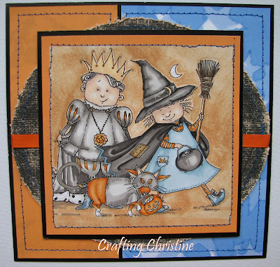
Well, they don’t call these ‘challenges’ for nothing do they! I was determined to do Mo’s Challenge using two of her images so had to learn how to do it first. Not that I have managed to ‘learn’ it as such - if you asked me to do it again without the assistance of the ‘how to...’ mentioned on the FAQ help desk (here), I wouldn’t remember. I know, I know, practice makes perfect! LOL. Of course I have to make it even more difficult for myself in choosing two more complicated images to overlap...but I did it. They were then coloured with my Promarkers and given a background of Tim Holtz’ Tea Dye Distress Ink (applied with a sponge) as well as a Promarker shadow edge.

As for the paper, the one with blue stars is from Crafter’s Companion and the orange with ‘spooky shadows’ (though they are not showing up very clearly on this photo), is from Create and Craft’s Triple Treasure’s CD. The oval shape is made from Core’dinations Black Magic card, remarkably the Cauldron pack! It has had sandpaper rubbed over it to reveal the orangey core and its edges distressed. Everything is sewn into position using blue thread to tie in with the stitching on the witch’s pinafore dress. The ribbon was from my stash.

Bye for now,

Tine :)

Wednesday 2 June 2010

Sam goes Splish Splash


Card for Challenges:
I Love Promarkers – 2 papers, 3 buttons and 1 ribbon

Inlinkz – boy/ colour scheme

Everybody Art Challenge – Summer

Papertake – Fun

Mo’s Digital Challenge – Babies plus ribbon or bows.

Hi everyone, and first of all I would like to thank the lovely ladies at I Love Promarkers for having the faith in me to choose me as their Guest Designer for June. I am totally thrilled!
I hope this card, and the ones to follow don’t let you down.

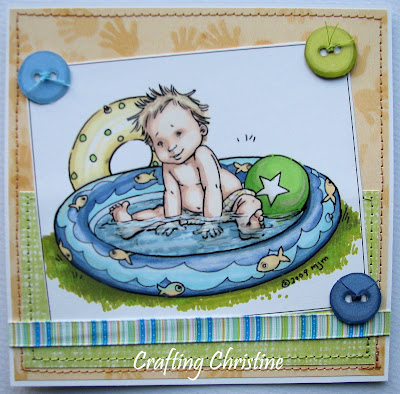
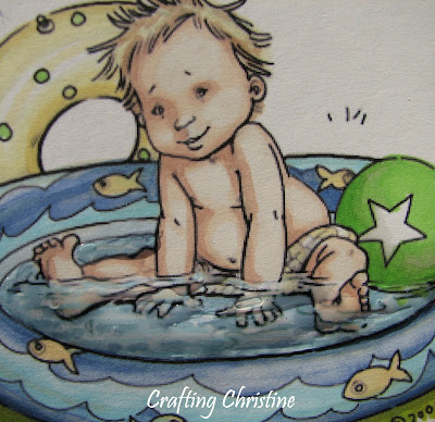
So, as you can see I have used this adorable cherub drawn by Mo sitting in his paddling pool and I have chosen to call him Sam for some totally unknown reason. Following the colour scheme chosen by Inlinks, he has been coloured in with my Promarkers and the water (I do hope you can see it well enough in the photos), has been made all shiny and hopefully water-like with the use of Glossy Accents.

The two papers I chose to use are the sandy hand prints from Crafter’s Companion and a green weave from HOTP and these have been sewn onto the white card ground. I have also used white card to create the 3 buttons and hopefully my Promarkers have given the dimension of a real button. The ribbon is from my stash.

What fun I have had chasing the sun around the house to photograph this card. Not that I am complaining that the sun is back, far from it, but it never shines on the spot I need it to! LOL....and then to make matters worse, when I came to add my picture to the blog I found that I had accidentally erased it, by which time the sun had vanished from our house entirely so I hope the photo is OK.

Well, that is all for today I think and I would really appreciate it if you could leave me a comment as you browse through blog-land and I thank you for it in advance.

Tine :)